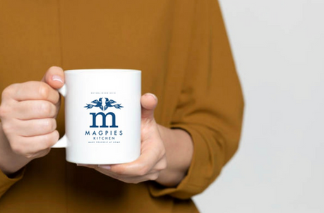
Magpies Kitchen
Brand Identity
Logo Design
Stationary
Signage
Magpies Kitchen landed on our desks as a home-style brand with big dreams: warm welcomes, family-friendly meals and kitchen moments worth sharing. Our mission was to craft a visual identity that felt inviting and authentic — a brand voice as comfortable as your favourite apron, yet as sharp as the chef’s knife that gets the job done.
We anchored the new look in strong foundational elements: a clean wordmark rooted in kitchen-classic typography, paired with a subtle icon that hints at both connection and craftsmanship. The colour palette bridges the familiar and the fresh — soft neutrals with pops of rich, food-forward tones to reflect the flavours and warmth that Magpies Kitchen stands for. For packaging, menus and touchpoints, we introduced simple patterns and friendly typographic treatments that brings the brand to life and says “Pull up a chair. We’ve got something good cooking.”


